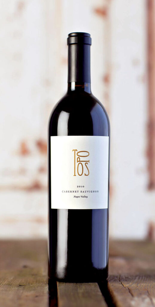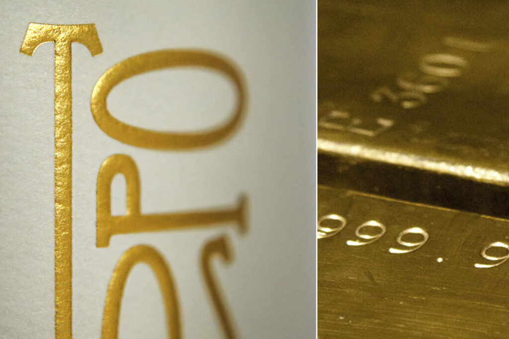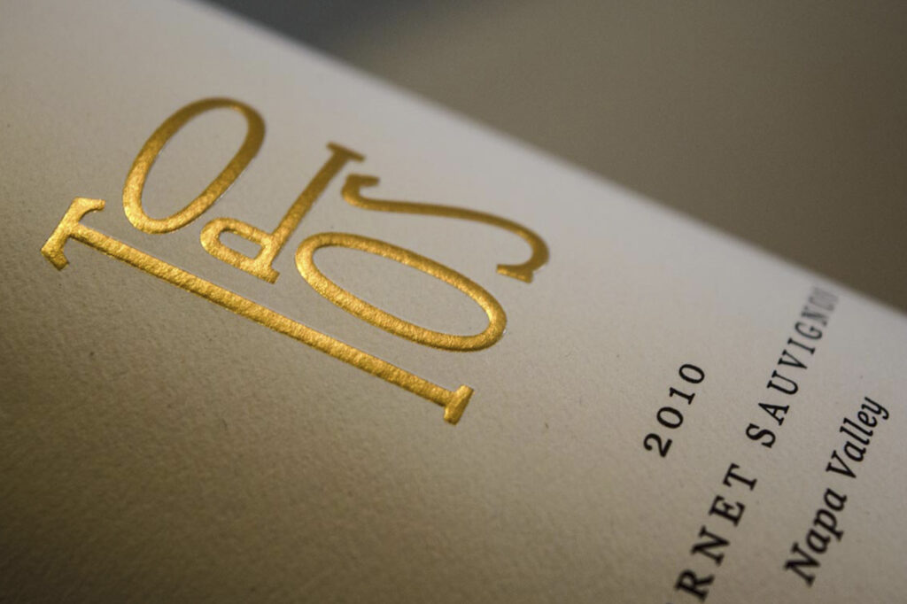
The meaning of Topos (from Greek) is 'a sense of place' and 'commonality.' Sourced from mainly mountain vineyards, the owner and winemaker wanted to evoke this feeling in a simple, elegant and iconic design. It all came down to creating a unique logo design. By showing height with the letter T, we communicate mountains, and the rest of the letters arranged in a unique way expressed the feeling of togetherness. It was such a creative lay out we all felt it didn't need to be distracted by any other design element. Simplicity was achieved and the addition of foiling and embossing of the letters brought elegance to the package.
Cabernet Sauvignon
Gold foiling
Embossing

