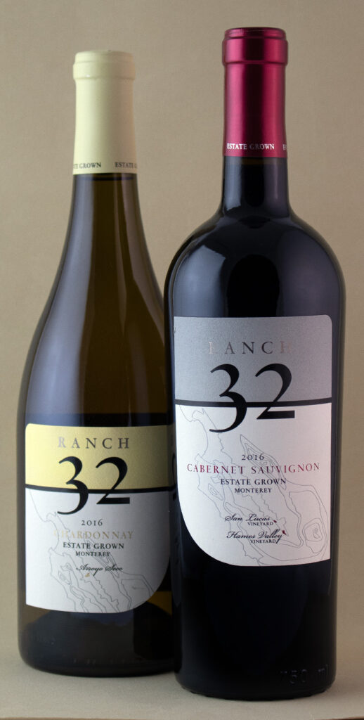
The wine market is one of the most crowded categories, filled with traditional label designs. It takes some creativity to stand out. Ranch 32 had already established a reputation for it's prestigious location, but its old map label design wasn't sufficiently differentiated from all the other map designs on the shelf. Being a must-keep element, we turned our attention to a unique design for the brand name. The answer was to draw attention, without being too distracting or cheap looking. The client loved our through-the-brandname, split label concept. It was the perfect solution to preserving the hand-drawn map, while making all the difference with a unique label construction. Standing out doesn't require leaving the norms of the wine category all together. It just takes some creativity to go beyond the norm.
Cabernet Sauvignon
Chardonnay
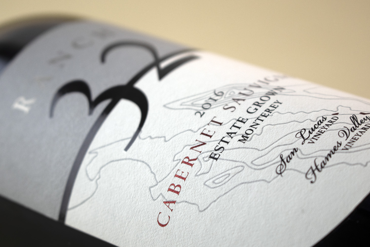
Black and gun-metal foils
Debossed topographical lines
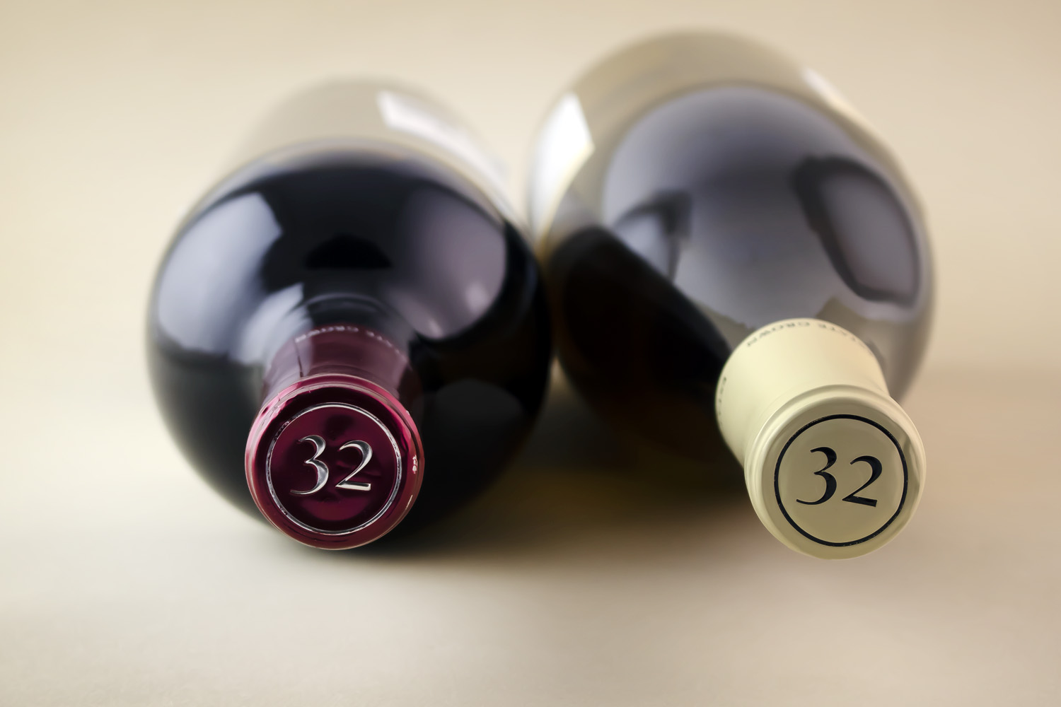
Embossed closures

